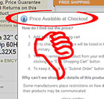
I buy things at Newegg. I have found them to be a trustworthy merchant. However, they’ve just instituted a new policy that I find irritating on a number of levels. When I see an item for sale, I want to know how much it costs. They have just instituted a “Price-Available-at-Checkout” policy. This is different from their already inconvenient “See-Price-in-Cart” practice, where some items are set so you cannot see the price until the item is in your cart. Continue reading “Newegg: Axe the Price-Available-at-Checkout policy.”
Tom’s Toothpaste – Take two, they’re small…
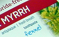
I like Tom’s toothpaste, but like so many other products, the parameters that make the product what it is seem to change every six months. In a previous story, I showed how Tom’s had simplified their design from Serif fonts and difficult-to-produce imagery to mostly sans-serif, less wording and less graphics on the front of the tube. But now they’ve gone to plastic tubing instead of metal tubing – which I preferred – and they’ve gone from 6.0 ounces to a 5.5 ounces per tube. Continue reading “Tom’s Toothpaste – Take two, they’re small…”
Arduino Brain Machine
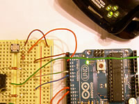
I got an Arduino UNO for Christmas. Arduino is an open-source electronics prototyping platform. It can be used to create anything from a simple web server to a hand-held game. With a few additional inexpensive electronic components, you can create a working prototype of a machine that actually does something useful or fun. Continue reading “Arduino Brain Machine”
Product Layout and Design Is Going Simple.
It may be a response to economics, or it may just be a fashion trend. Product design is going simple. As an example, let’s look at Tom’s of Maine toothpaste line of products. They used to have very colorful boxes. The different colors made it easy to locate your preferred flavor on the shelf faster. I always looked for the purple box for the Fennel-flavored Propolis & Myrrh Anti-plaque toothpaste. Today, I went in to find the box and it was gone. It took me a few seconds, but I saw that all the boxes were now all the same layout and same color, but each sporting a slightly different color photo of whatever flavor they are. The emphasis is taken off ‘antiplaque’ and ‘natural’ and put on ‘propolis & myrrh’. Continue reading “Product Layout and Design Is Going Simple.”
A Google Artistic First?
Rarely in the history of Google’s logo alteration is the search engine logo image so removed from its original shape that the word ‘Google’ is not readily apparent in some respect. As attractive as this Mucha tribute is, I have trouble seeing the word ‘Google’ in this adaptation of Alphonse Mucha’s work. Even with the Joseph Frank birthday image I could squint and imagine the word ‘Google’ wrested from the lines in the image. Continue reading “A Google Artistic First?”