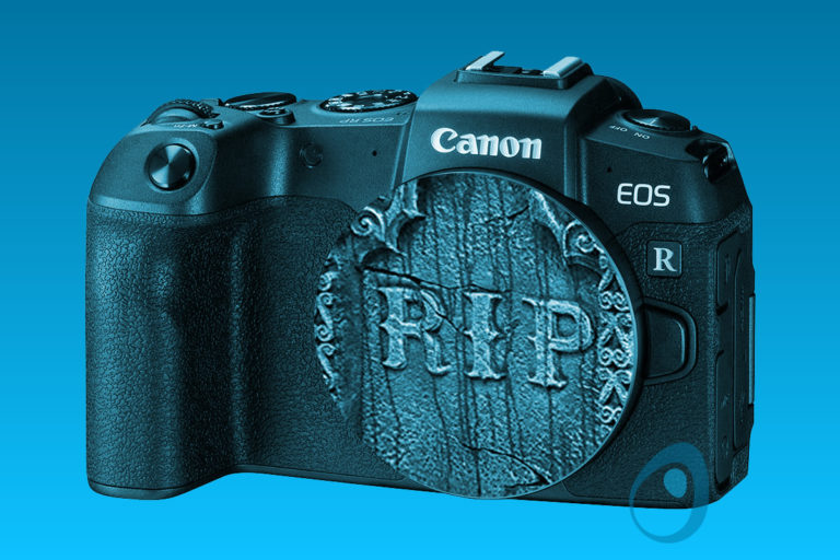
Canon EOS RP – Hamper Gate
Canon’s EOS RP just came out. It has been panned by the camera community for a number of reasons, all of them unfortunate. But the story starts with the Canon EOS M50.
 I like Tom’s toothpaste, but like so many other products, the parameters that make the product what it is seem to change every six months.
 It may be a response to economics, or it may just be a fashion trend. Product design is going simple. As an example, let’s look at Tom’s of Maine toothpaste line of products. They used to have very colorful boxes.
![]() Filemaker 11 is certainly leaps ahead of previous versions. charts, scripted report creation, quick find, object inspector, object focus scripting, portal filtering and object badges are awesome editions to the pallet of tools available for data developers and designers. There are a lot of excellent reviews out there about what the latest version contains. However, there are a few features that could use some attention.
Filemaker 11 is certainly leaps ahead of previous versions. charts, scripted report creation, quick find, object inspector, object focus scripting, portal filtering and object badges are awesome editions to the pallet of tools available for data developers and designers. There are a lot of excellent reviews out there about what the latest version contains. However, there are a few features that could use some attention.
 Rarely in the history of Google’s logo alteration is the search engine logo image so removed from its original shape that the word ‘Google’ is not readily apparent in some respect.