A Google Artistic First?
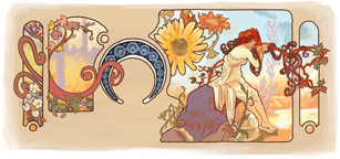 Rarely in the history of Google’s logo alteration is the search engine logo image so removed from its original shape that the word ‘Google’ is not readily apparent in some respect. As attractive as this Mucha tribute is, I have trouble seeing the word ‘Google’ in this adaptation of Alphonse Mucha’s work. Even with the Joseph Frank birthday image I could squint and imagine the word ‘Google’ wrested from the lines in the image.
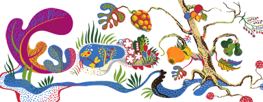
But with the Mucha image, I find myself deconstructing the image consciously in an attempt to see the word ‘Google’.
There is that April Fools day when they changed their name to Topeka…

I finally got the line-art for Google and juxtaposed it on the image.
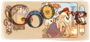
It works surprisingly well. In google tradition, the lowercase, second ‘g’ isn’t really there – we’re left to imagine it since we have the rest of the letters. I’d really like to see a larger implementation of this Google ‘doodle’ elsewhere because it is beautiful. I applaud Google’s doodle team for not being overly bound in their interpretation of the logo.


 I recently got an email from my friend warning about pending doom coming from a computer virus. There’s a copy of it in the blockquote below.